A Year After UMKC Updated Their Logo, How Do Students Feel?
Changes made in 2022 were underwhelming to some, but necessary according to those who made it.
UMKC has had an array of logos over the years, but this change seemed minimal compared to others. “The changes were meant to be subtle and improve its readability. Especially in the digital spaces where the logo has to be really small,” said Michael Awua’duah, a graphic designer for UMKC.
February 3, 2023
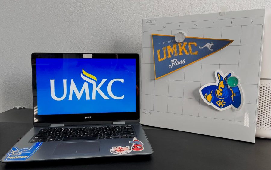
Its been almost a year since the Department of Strategic Marketing and Communication announced a revamp of the classic UMKC logo, and the lack of change in the design has yielded a mix of reactions.
“I don’t think it was worth changing,” said Samantha Lam, a marketing student at the Bloch School of Management. “It’s basically the same thing, just bold.”
Michael Awua’duah and Sarah Richardson, two UMKC employees working as graphic designers, said money and the public’s intake of digital media are factors that were considered when making the changes to the logo.
“UMKC was going to update some of the signage and that’s what kicked off the let’s make this happen now,” Richardson said. “We didn’t want the logo to be too different where we had to change everything at once. That would have been a huge budget undertaking and not physically responsible.”
Many students believe they understand why the change was made, but still express favor for its predecessor.
“I like the old one more; the font looks nicer and crisp,” said marketing student Harper Zimlich. “I get why they did it though, it’s probably more legible.”
Zimlich was on the correct road in terms of reasoning.
“The changes were meant to be subtle and improve its readability. Especially in the digital spaces where the logo has to be really small,” Awua’duah said. “The original logo was kind of created in a time period where digital wasn’t as prevalent as it is now.”
Despite the minimal changes, the graphic designers can clarify as to why the logo was not significantly altered.
“We’ve worked with the logo a lot internally,” Richardson said. “I think there were just some ways we wanted to elevate it to the next level, not necessarily redoing it or rebranding it.”
cmdck@umsystem.edu


